A Handy Guide by Gemini Geeks
Hello friends! 🙏
Imagine visiting a ‘mela’. The sights, the sounds, the buzz! Among all the hustle, what catches your attention the most? The bold signages of stalls, right? In the digital ‘mela’ that’s your website, typography plays a similar role. It’s what captures and holds your visitors’ attention.
Join us on this exciting ride to understand typography, the unsung hero of web design.
At its core, typography is all about text – how it looks, feels, and engages. Think of it as choosing the right outfit for an occasion. Just like you wouldn’t wear a heavy ‘sherwani’ to a casual get-together, your website’s content shouldn’t be dressed in any random font.
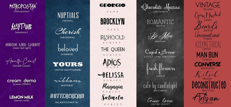
Pairing fonts is like preparing a plate of ‘chole-bhature’. One’s spicy, the other’s mild, but together, they’re perfection. Some tips to remember:
Remember the big ‘hoardings’ on highways that you can read from a distance? That’s the kind of impact your headlines should have. But, the smaller signs pointing directions? That’s your body text.
Reading a line that goes on forever is like listening to a never-ending story from an old uncle at a family gathering. To keep readers engaged:
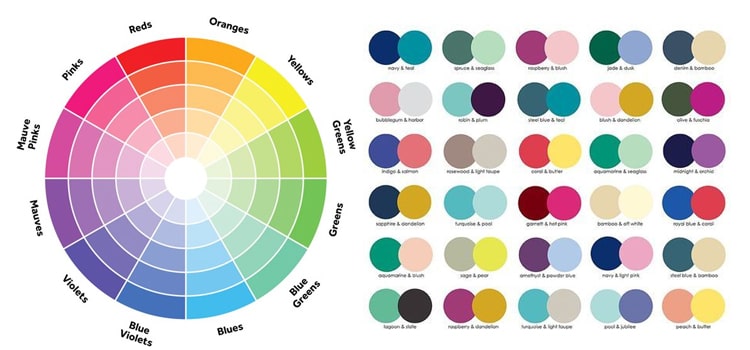
Choosing the right colour for text is akin to selecting the right shade for your home walls. It sets the mood.

ALL CAPS? Feels like someone’s shouting at you during a heated ‘gully’ cricket match, right? Use sparingly. It’s not easy on the eyes for long reads.
You wouldn’t prefer a dish with too many masalas overpowering the main ingredient, right? Similarly, keep your content straightforward and readable. Stick to familiar fonts like Arial, Helvetica, or Times New Roman.
Typography is an art. And like every artist, you need to find your rhythm, your style. With these simple yet effective tips from Gemini Geeks, make your website text stand out, engage, and most importantly, communicate effectively. After all, what’s a website if not a means of telling your story to the world?
Always remember, in the vast ocean of the internet, it’s the little details, like typography, that make the ship sail smoothly. And if ever in doubt, we’re just a click away.
Stay connected for more tips and insights into the digital realm. Safe journeys through the digital waves!
Call Us Now on +91 9041001555 or send us an email to admin@thegeminigeeks.com to discuss your project