
Mobiles. They’re as much a part of our lives as our morning cup of chai. But, did you ever think that the little gadget you carry around could dictate the way websites are designed? Mobile-First Web Design is not just a fancy term; it’s the need of the hour. Dive in with us as we simplify why having a mobile-first design can be the game-changer your website needs.
Imagine you’re tailoring a shirt. Mobile-First Design is like ensuring it fits snugly to a lean frame, and then making adjustments so it also fits a broader build. Traditionally, web designs were created for desktops first and then scaled down for mobiles. However, Mobile-First means you design for mobile devices initially, and then scale up for larger screens.

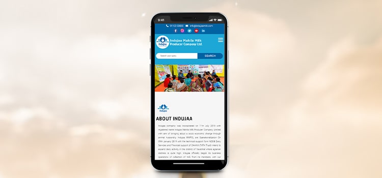
Look around you – at homes, in metros, at the local dhaba – almost everyone is engrossed in their phones. The statistics agree. More folks are accessing the internet via their phones than their computers. If your website isn’t mobile-friendly, you might just be missing out on a massive chunk of audience!

Mobile users are on the go. They want information, and they want it fast. Mobile-first designs are streamlined for this very reason. No one likes to wait, especially not for a website to load!
Imagine reading a lengthy article on a mobile and constantly pinching the screen to zoom in and out. Annoying, right? Mobile-first designs ensure that content is readable, buttons are easily clickable, and the navigation is smooth as butter.
Consistency: Mobile-first ensures a consistent look across devices. Whether viewed on a phone or a desktop, your website remains uniformly elegant.
Efficiency: With a clean design and simple navigation, users find what they’re looking for without any fuss. It’s like finding your favourite dish at a big Punjabi wedding!
Gemini Geeks believes in results. A mobile-first design doesn’t just look good; it translates to better business. Improved user experience leads to longer site visits, more interaction, and eventually, higher conversions.

Starting small gives designers the creative freedom to experiment. They can focus on essential features, optimise them for mobile use, and then think of additional features for larger screens. It’s akin to laying the foundation of a house; once that’s robust, you can think of adding the bells and whistles!
Mobile-First with Gemini Geeks
Join hands with Gemini Geeks, and let’s make your website a treat for mobile users. Remember, the mobile-first approach is not just a trend; it’s the new normal. With rapid technological advancements and shifting user patterns, it’s about time you embraced the future. After all, in the world of web design, just like in life, it’s essential to move with the times.
In Conclusion
In the rapidly evolving digital world, where mobiles have become an extended part of our being, a mobile-first web design approach is indispensable. Just as you wouldn’t want your morning chai too hot or too sweet, your website needs to be just right for your mobile audience. And that’s where mobile-first design comes into play. Make the shift, and see the difference it brings to your online presence. Cheers to staying ahead in the digital race!
Call Us Now on +91 9041001555 or send us an email to admin@thegeminigeeks.com to discuss your project

